
BRIEF
LinkedIn wants to boost its "Groups" feature by adding collaboration and task management for companies and co-workers.
CLIENT
Project for User Experience Design Immersive at General Assembly, Sydney 2014
CHALLENGE
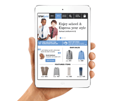
TrueSprit wants to create an appropriate experience for their target customer that could be delivered via iPad as the primary delivery channel.
TOOLS
Omnigraffle, Photoshop CC, Excel, Sharpies & paper.
DURATION
2 weeks of 8 week course
MY ROLE
Realize sketches for all pages, realize wireframes in Omnigraffle, realize an early-prototype in InVision, realize a mockup for the home page, improve and update user flows and sitemaps, execute design iterations, provide innovative ways to communicate our design.
TEAM
Deepa Dhupalia
James Feng
Sara Michelazzo
COMPETITIVE ANALYSIS & RESEARCH
The competitor analysis involved both school uniforms e-commerce and fashion e-commerce. This research helped us to understand what the competitors are doing and what they are not doing in order to define a strategy.
School uniform e-commerce analyzed: Your Uniform Shop, School Uniform Australia, Made for School, Yeroga Uniforms.
Fashion e-commerce analyzed: Uniqlo, Polyvore, Net a porter, Yoox, Asos.

CARD SORTING & SITE MAP
Card sorting was used to define categories for TrueSpirit navigation. The main problems were:
After we defined the categories, we organized the rest of content in the Site Map.
- Define the main criteria for organizing categories (tops and bottoms, boys and girls, summer and winter uniforms).
- Define subcategories.
- Identify in which subcategory to divide items.
- Define clear labels for categories, subcategories and items.

SKETCHES & SCENARIOS
I have started to create sketches of the product page and of the category page. The goal was to condense in one design the best ideas collected during the competitor analysis. In order to reach the best solution possible, the team sketched every page individually and reviewed them as a team. I have also created some scenarios including low fidelity sketches to test the navigation system and to understand which features to include in the e-commerce.

PERSONAS
Personas were given as part of the assignment. Our role was to keep them in mind, understand what they need, and build out personas as much as possible.
SARAH
Digital project manager, new to uniforms, spendy.

Goals & Features:
- Specific URL and login required to purchase mandatory and suggested clothes.
- School link in the global navigation.
- Materials and care instructions.
- Add to favorites "She likes to save items while browsing and purchase them at the end of the day"
JOHN
Accountant, single dad, frugal and tech-averse.

Goals & Features:
- Quick buy view in category page.
- Dropdown menu and filters (colors, prices)
MAIN PAGES
The wireframes were realized with Omnigraffle. On the left side of every wireframe there are some annotations, these include the description of the main features and the explanations for the design choices.
They represent, from left to right, the home page, the category view and the product page.

SCHOOL PAGES (CUSTOMIZABLE)
The wireframes below represent, from left to right, the school home page, the category view (with compulsory and suggested items) and the product page
.

CHECK OUT PROCESS
The wireframe below represent the 3 steps to check out: shopping bag, payment and confirm message.

NAVIGATION
The wireframes below represent the navigation schema. The maps help to understand which pages are connected and where there are shortcuts to reach pages. The wireframes represent from left to right the global navigation, the contextual navigation, the filter, the contextual breadcrumbs and the footer.

JOHN'S USER FLOW
The wireframes below represent the sequence of the steps that John has to take in order to purchase a white polo t-shirt and some blue pants for his daughter. I have used this set of wireframes to create a clickable prototype for iPad that simulates John’s flow.

USABILITY TESTING
The prototype has been tested on 3 people thorough a Guerilla Testing.
Pain points:
- We expected picture to zoom but user expected it to be a link to go to the details page dropdown menu and filter (colors, prices).
- One user would have saved his profile if it didn't include saving his credit card details.
- User went to sales button to find a polo shirt rather than top navigation bar.
- 2/3 users could not find the alternative views (e.g. gallery versus list).


VISUAL DESIGN
Starting from the home page wireframe, I have realized the home page mock-up using Photoshop. The goal was to understand if the home page wireframe could be successfully converted in a mock-up. The visual design I have realized follows the business style requirements and uses the logo colors.
Business style requirements:
Fresh, modern, light hearted, open, appealing, friendly, curated, there when you need us but not in your way.
Colors:
Light blue and dark gray.
STORYTELLING
In order to communicate our design effectively, during the presentation, we have played a role game. Deepa was the external narrator and James was pretending to be John, one of our personas. This allowed us to show the full prototype explaining what the user does, sees and thinks while purchasing the school uniform items.
After the role game I have explained our group's main design choices and the process we went through in order to make our design decisions.

DO YOU WANT TO SEE MORE ABOUT THIS PROJECT?
MORE WORKS
THE DESIGN PROCESS UNCOVERED FROM SKETCHES TO PROTOTYPE
User research, Empathy Mapping