INTRODUCTION
PRODUCT
iAuditor is the world’s most popular Inspection Checklist App used to conduct over 25,000 safety inspections per day in 80 countries in 23 languages. iAuditor is available on iOS, Android, Google Glass, Android Wear and as Web Application.
CHALLENGE
Identifying the pain points of the first time user experience through usability testing and data analysis. Find opportunities to improve the overall onboarding experience. The project aims to reduce the learning curve and to increase motivation, in order to improve engagement, acquisition and retention.
DURATION
Five months: from December 2014 to April 2015.
TEAM & MY ROLE
Me (experience design lead), Robbie Mchintosh (visual designer), Shaun Donnel (UX engineer/prototyper), Blake Pelling (content strategist), Matthew Antoniazzi (data analyst).
My key responsibilities are to:
- conduct and analyse usability testing
- identify pain points in the user journey
- set priorities according to the Product Owner
- translate the research results into wireframes
- facilitate collaborative design meetings, involving designers, developers and also members of support and marketing teams
- act as Scrum Master to ensure that the team delivers prototypes and design specs to developers at the end of every sprint.
1. RESEARCH: IDENTIFY PAIN POINTS IN THE USER JOURNEY
In order to identify the pain points in the user journey I have adopted the following techniques:
- experience mapping, integrated with empathy mapping
- usability testing, from remote and in person, on segmented users
- data analysis about funnel drop-off and features usage
- user interviews to develop personas
EXPERIENCE MAP
SafetyCulture Experience Map helped me to understand all the steps from users to customers and all the touching points involved inside and outside the apps. I built the map with UXPin, printed it on an A1 and added a couple of handwritten notes. I hanged the poster on a wall in a common area, asking for feedback to facilitate contributions from anyone in the company.
USABILITY TESTING
The information provided from the support regarding the common issues were extremely useful to define the path from new user to core users. Anyway in order to reduce the drop-off during the first day or week, the team needs to understand what a new user, someone that downloads the app for the first time thinks, says, feels and does. Not everyone calls the support or search the knowledge base to get started with an app that he has just downloaded.
I conducted usability testing on iAuditor iOS and on Android. The remote usability testing have been conducted using the platform usertesting.com. The marketing provided the demographics information to set the screening.
Below some answer to the question: "What was the most frustrating thing?"
“Trying to figure out how to get started. I wouldn’t call it frustrating however, I just would like to have seen some sort of tutorial/walkthrough on how to get started. Really it wasn’t all that bad, just takes time.”
“I actually found the tool to be extremely inuitive to use. I would have had no problem creating rather complex task list in it.”
QUALITATIVE ANALYSIS
We conducted a series of usability testing on usertesting.com and we analysed the data in order to get clear understanding of the challenges that the user faced during his first time of use.
QUAntiTATIVE ANALYSIS
We used Google Analytics and Amplitude to understand the demographic of the target we were designing for and the most used devices in order to set priorities. Funnels allowed us to understand where we had the highest drop off.
USER INTERVIEWS & PERSONAS
We developed a set of interview questions and then reached out to 20 customers from our support queues and invited them to chat about how they used the product, and how they go about their day to day activities and roles.
We then broke down the results into common themes and the common positions users held in their work places.
Talking to users allowed us to understand the pain points of the main two categories of iAuditor: the manager and the contractor.
2. TRANSLATE RESEARCH RESULTS INTO WIREFRAMES
After collecting all the research results from usability testing, marketing team and support, I have created a set of wireframes focusing on the FTUX. The wireframes provides quick wins to improve the current experience and provides examples of before and after on all the screens in the first level of navigation.
The high fidelity wireframes included:
- menu improved in order to show hierarchy and contrast (most of our users work outdoors)
- introduction of meaningful empty states with clear call to actions, examples and dummy texts
- addition of shortcuts to improve second level navigation
- more effective help section
- gamified user profile
- beautiful icons and delight elements
BEFORE
Problems identified in this implementation:
- long menu without clear hierarchy
- many empty screens with not clear call to action
- overwhelming help section
- not engaging profile page
3. build a meaningful WALKTHROUGH
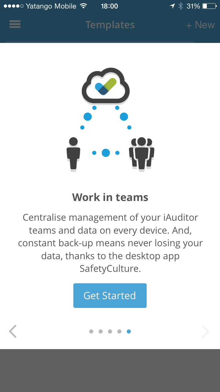
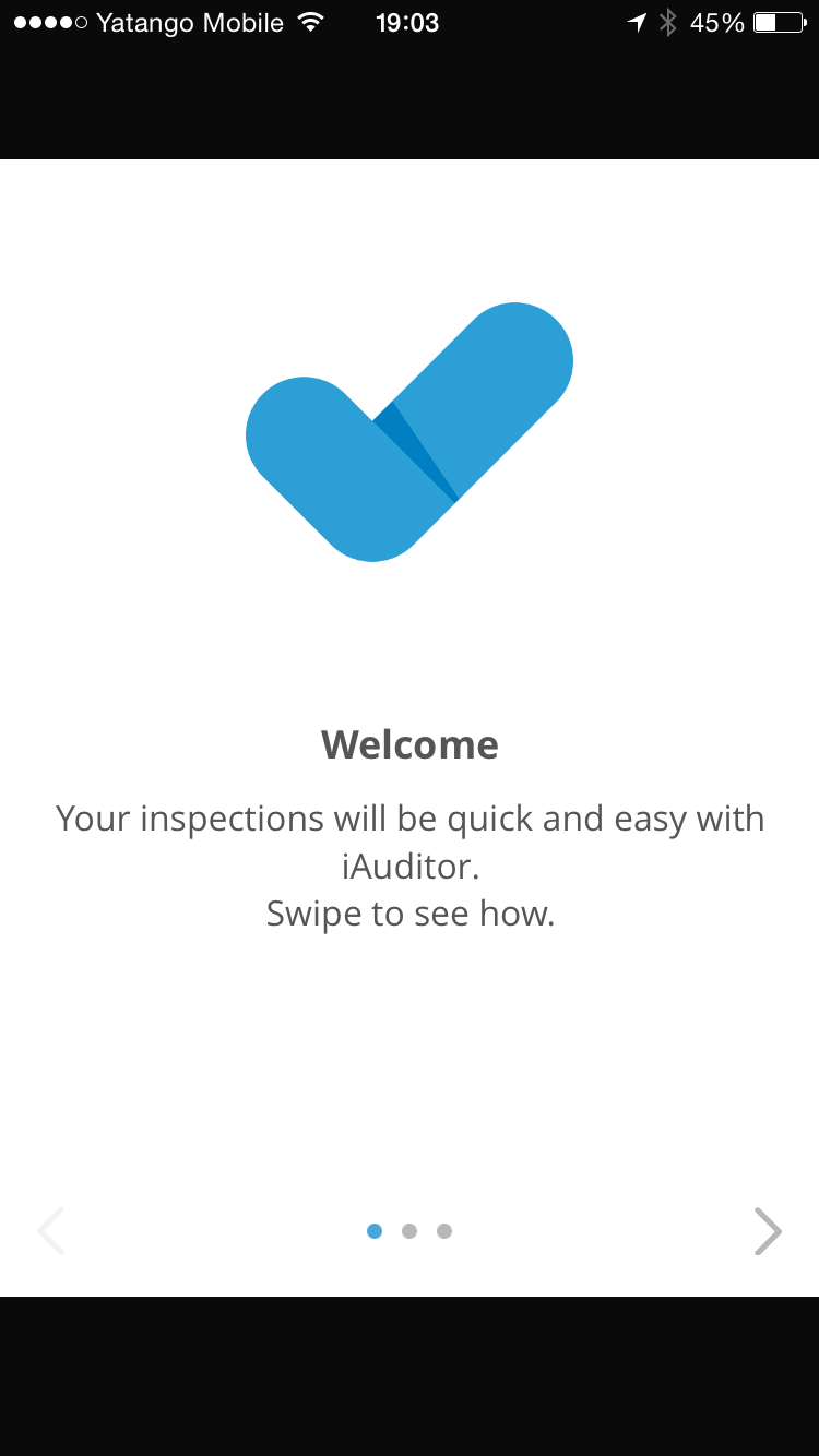
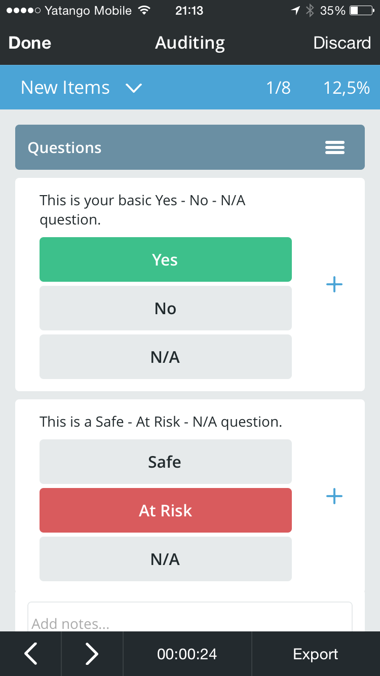
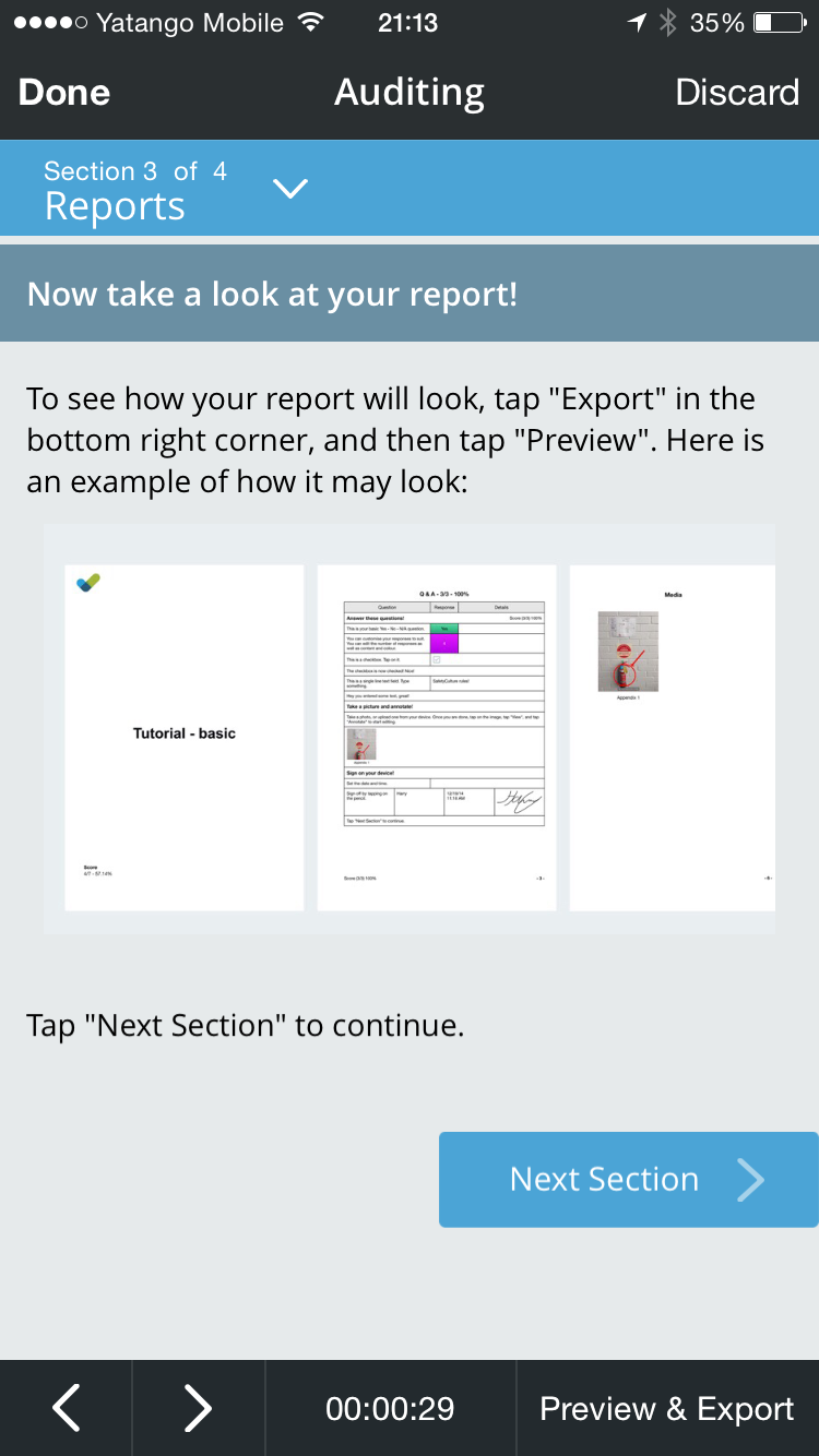
There are many different types of walkthrough: joyriding approach, do something approach, set up approach, everything at once approach. We have started from the minimum viable experience (MVE) for this feature: a static walkthrough. We measured the drop off from the walkthrough and it was quite very low so in the second iteration we have included a full tutorial about how to conduct audits. The tutorial has been built using the core features of the app: the template editor and the auditing view. When the user takes the tutorial, he is exposed to the auditing view in a controlled environment.
FIRST ITERATION: static approach
SECOND ITERATION: do something approach
4. introduce meaningful empty states
Empty states are an extremely powerful technique to guide users towards "coreness." When well integrated inside the overall experience, they guide users to complete main actions in order to reveal the value of the product. Also, empty states are a great opportunity to add some delight, through meaningful and engaging graphics and animations.
BEFORE
AFTER
NOTES
Before our iteration, the app used to display to new users an empty dashboard. This behaviour caused some confusion and sometimes user though that the feature wasn't working properly.
The new empty state trains the user about the value of the dashboard, giving them a graphic preview. Also the button guides them to complete the action that will fill the dashboard with useful data.
“I don’t understand what this is or does.”
5.CUSTOMISED FIRST TIME EXPERIENCE
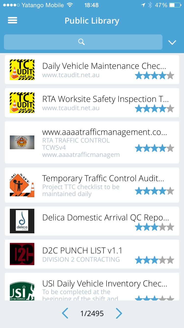
The Public Library is a collaborative space for all iAuditor users. It creates a large library of templates that users can download for free. The current problem is that the user in order to understand the value of the Public Library has to set the right filters to display informations that are relevant for the user. The iteration on this area aimed to provide a first time experience that is customised by the user based on the industry he belongs to. In this way, the information displayed are meaningful and the value of the Public Library is revealed.
BEFORE
FIRST ITERATION
SECOND ITERATION
The second iteration is more inviting, allows to the user to understand the variety of templates they can download and to navigate towards what they are interested in.
6. GRACEFULLY MANAGE COMMON ERRORS
iAuditor is widely used by people in their workplaces: airports, roads, platforms in the ocean and so on. Contextual enquiries and survey revealed that for many users, internet connection is not available. . Internet connection is not always available. The Public is available to users only when they are connected to internet. In order to train users about this we came up with en error message that explain to the user why the Library is not loading.
BEFORE
FIRST ITERATION
SECOND ITERATION
7. PROVIDE CONTEXTUAL HELP FOR COMPLEX AREAS: TOOLTIPS
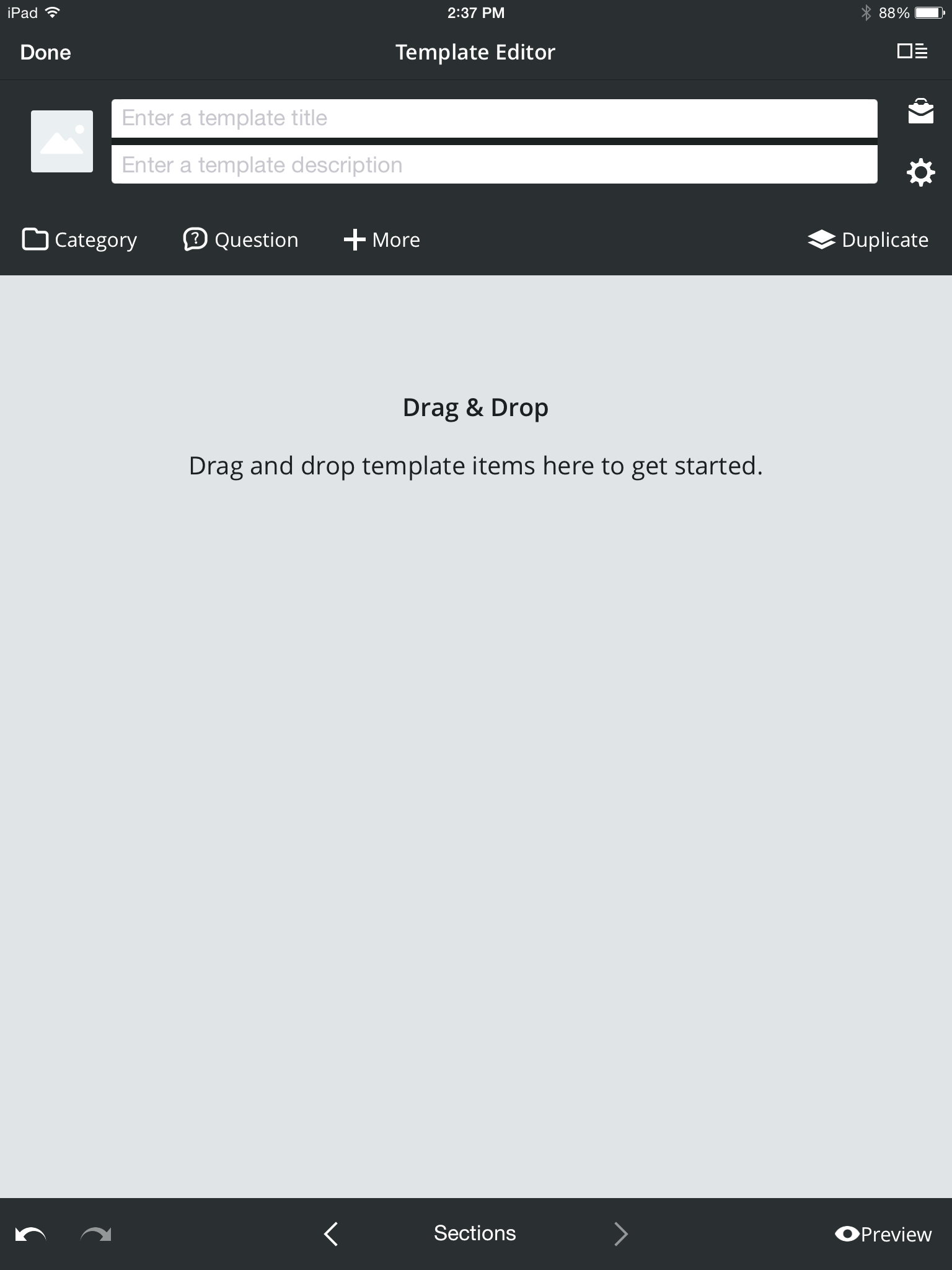
The Template Edit allows users to create and edit forms with drag & drop simplicity. While basic forms are easy to create without help, some advanced features inside the Template Editor require explanations.
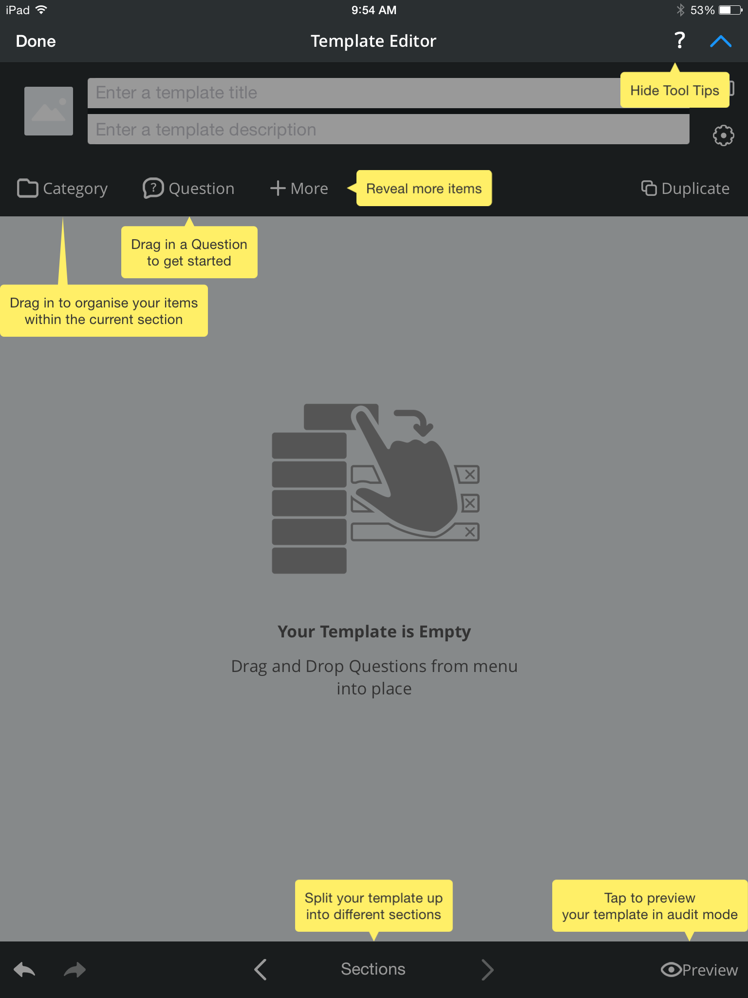
Usability testing on the tooltip in the template editor revealed that some people reads them during their FTUX, others close them immediately to come back to them in case of need.
BEFORE
FIRST ITERATION
8. MAKE SURE YOUR HELP, HELPS
In first place, product should be simple and intuitive. But, there are may conditions that require to be solved integrating a help section within the app. In the iAuditor case, the conditions are:
- the targeted users are generally not very tech savvy (some have never used iPad before)
- iAuditor is a very powerful product and the advanced features have a learning curve of a few days/weeks based on the user
In order to improve the help we run a survey to ask current users how they become proficient with iAuditor. We collected information about their current behaviours ( organic search, knowledge base, contact support) and we asked them what is their favourite way to learn: reading articles, video trainings, FAQs, etc.
Usability testing and surveys revealed that people where relying on the help inside the app to get started. The current help section within the app was a link to the Knowledge base. The amount of information available was scaring the users that were looking just for a quick way to get started. The marketing and the support teams built a series of Video Training that in 20 minutes covers all the basic features. Advanced users can still access the knowledge base from the bottom bar.
BEFORE
FIRST ITERATION
USER SURVEY'S RESULTS
9. INTRODUCE DELIGHT ELEMENTS AND GAMIFICATION
In order to engage users and to help them to understand the value of the overall app, I have identified certain key actions that unlocked gamified screens.
Because iAuditor allows to save hundreds of worker lives every years, it hasn't been hard to find an epic meaning or calling that could guide the gamification. If a user contributes to iAuditor uploading a custom template that will become available to all iAuditor users for free we make sure we make him feel part of the iAuditor community and we make him feel like our hero.
WIREFRAMES
10. VISUAL DESIGN MATTERS
Usability testing revealed us that some Android users thought that iAuditor was an "old App" because the visual design was not engaging and modern. After the launch of Google Material Design, we implemented the new design standard. The change was quite consistent, so in order improve the design without upsetting some of our less tech-savvy users, I have created a timeline to implement the design in various iterations. The whole redesign was deployed in three months and was well received by Android users.
BEFORE
AFTER
summary
The examples above are some of the iterations that have been more successful. The results have been:
- a decrease of the drop-off during the first month
- a decrease of tickets for the support regarding basic actions, basic features, request for help or solving common problems
- usability testing shows that the time to complete tasks to the aha moment is now 10-15 minutes shorter on average
Not everything that has value can be measured:
- the marketing team is happy to contribute to the product development providing researches and metrics
- the support team is happy to participate to the product development helping to define common problems and priorities
- users appear way less frustrated during usability testing on the first time experience
LINK TO LIVE PROJECTS
The next case study is about Information Architecture and how to Increase Revenues improving user flows.


