
INTRODUCTION
PRODUCT
SafetyCulture has a free app, iAuditor and a paid web app SafetyCulture. iAuditor is a free forever product because aims to save people lives, according to the company mission. The paid webapp, SafetyCulture allows to manage teams who use iAuditor.
CHALLENGE
Increase the revenue. The current project focused on helping the users to go through SafetyCulture conversion funnel, making very easy to start the free trial and pay for SafetyCulture.
The project involved many different touching points: Apple and Google Play stores, iAuditor iOS and Android, SafetyCulture webapp, emails, SafetyCulture website, support team
TEAM
Me (experience design lead), Robbie Mchintosh (visual designer), Blake Pelling (content strategist), Joanne Walter (designer and web developer for the website and support site), Matthew Antoniazzi (data analyst).
The project involved many touching points and almost all the department in the company were involved: design, marketing, support, development.
DURATION
6 months
MY ROLE
I was responsible for analysing the current status and defining the strategy in order to increase the acquisition in iAuditor.
- research the pain points and strengths of the current flow
- research and identify all the touching points involved in the project
- improve sign up flow for iAuditor Android and iOS
- improve sign up and login within SafetyCulture web app
- improve billing flow in SafetyCulture web app
- improve the overall messaging within the apps, the website and the emails
- propose a new vision for the support website (from research to wireframes)
- propose A/B testing variations for the SafetyCulture website
I have conducted user researches, content inventories, analysed flows, built wireframes and for the most complex projects I have created high fidelity interactive prototypes.
1. increase acquisition in iauditor for safetyculture
In order to increase the acquisition in iAuditor towards the SafetyCulture trial I have proposed to increase the visibility of SafetyCulture trial.
STRATEGY
- increase the visibility of SafetyCulture from 1 to 6
- understand which SafetyCulture features are related to iAuditor features in order to display contextual information


increase safetyculture (UPGRADE) VISIBILITY
Thanks to several researches conducted from the marketing department we were able to understand the reasons that motivate iAuditor users to upgrade to SafetyCulture.
We have created meaningful suggestions for iAuditor users to let them know about SafetyCulture and to expose them to the features they may be interested in.
The pop-up with the information about the feature and the button to upgrade are displayed based on different events:
- always visible buttons
- triggered events
This helps targeting intermediate and advanced users, and it doesn't add complexity for new users.
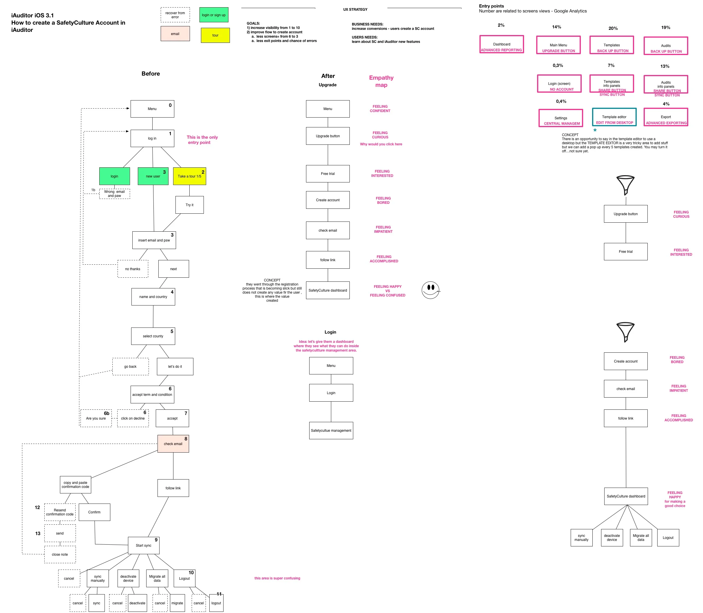
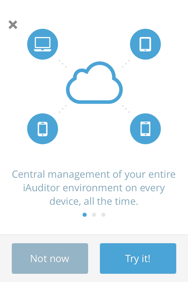
2. IMPROVE THE SIGN IN iauditor ios
BEFORE
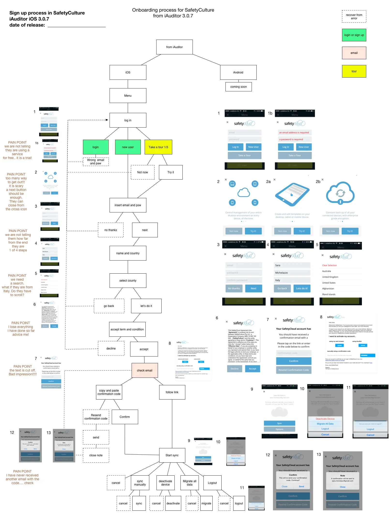
FIRST ITERATION

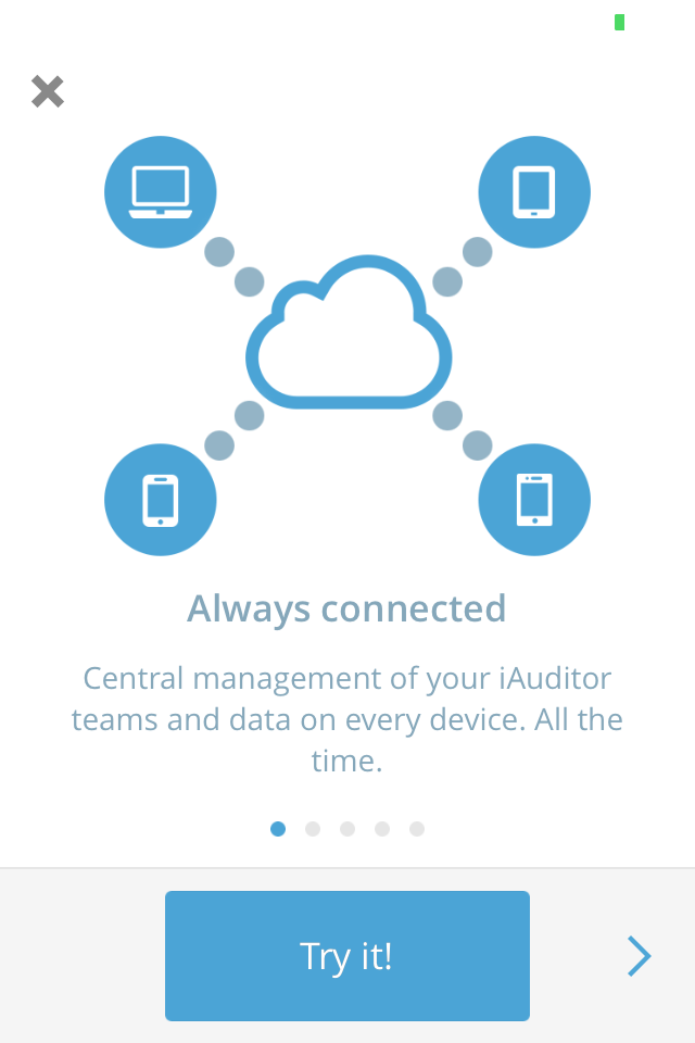
MOST SUCCESSFUL ITERATION
Removing the "Not now" button in the SafetyCulture walkthrough allowed to increase significantly the success of the funnel to the end of the walkthrough. Removing the button decreased the exit points and chance of errors.
3. IMPROVE THE SIGN IN FLOW IN IAUDITOR ANDROID
BEFORE
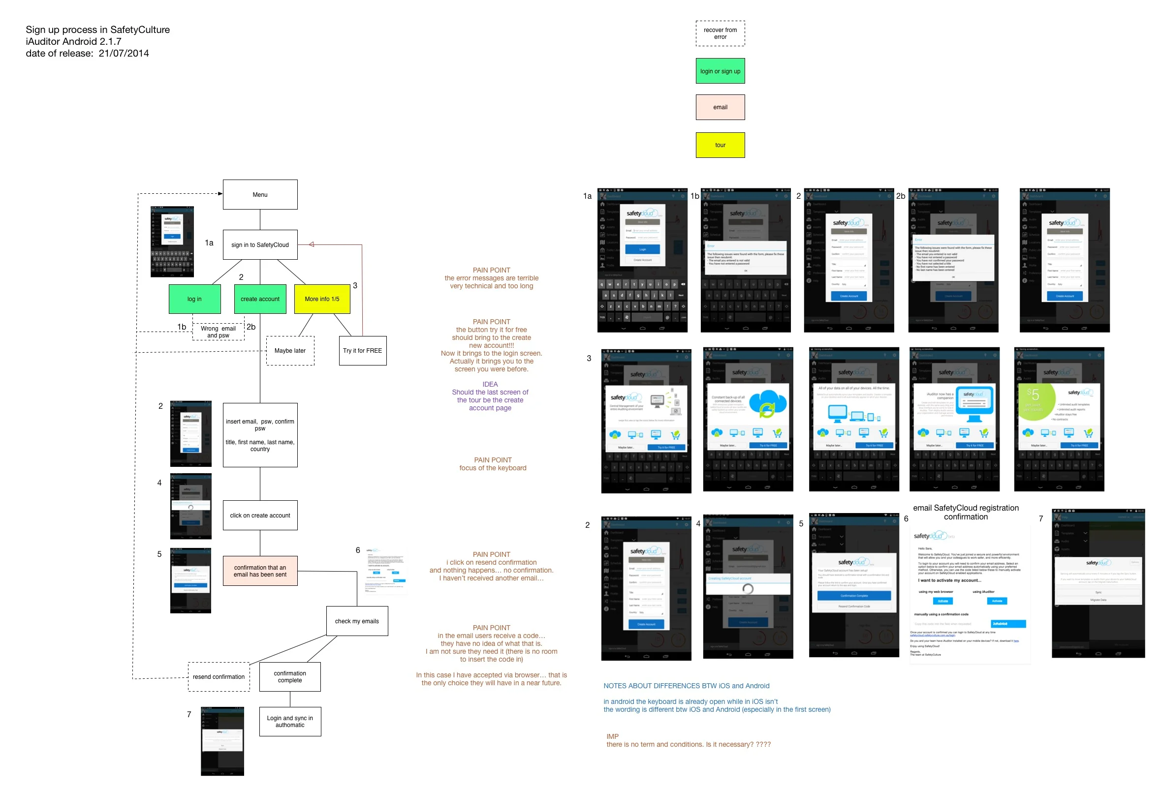
FIRST ITERATION

MOST SUCCESSFUL ITERATION
Analysing the flow allowed us to notice that the "Create Account" button in the Sign in screen was covered by the keyboard. After building the interaction to reveal the button even when the keyboard was open we follow other 3 round of iterations: 1)moving the button, 2)removing one field and 3) removing the placeholder text. All the iterations increased conversions.
4. IMPROVE THE log IN and sign up PROCESS IN THE WEBAPP
BEFORE
FIRST ITERATION


sign up flow
The redesign of the sign up process has improved:
- the overall flow
- the error messages
- error prevention has been included as inline suggestions
- improved external touching point: emails


LOGIN PROCESS
The redesign of the login process has improved:
- the overall flow
- the error messages
- error prevention has been included as inline suggestions
- improved external touching point: emails
5. IMPROVE THE BILLING FLOW IN THE WEBAPP
BEFORE
FIRST ITERATION


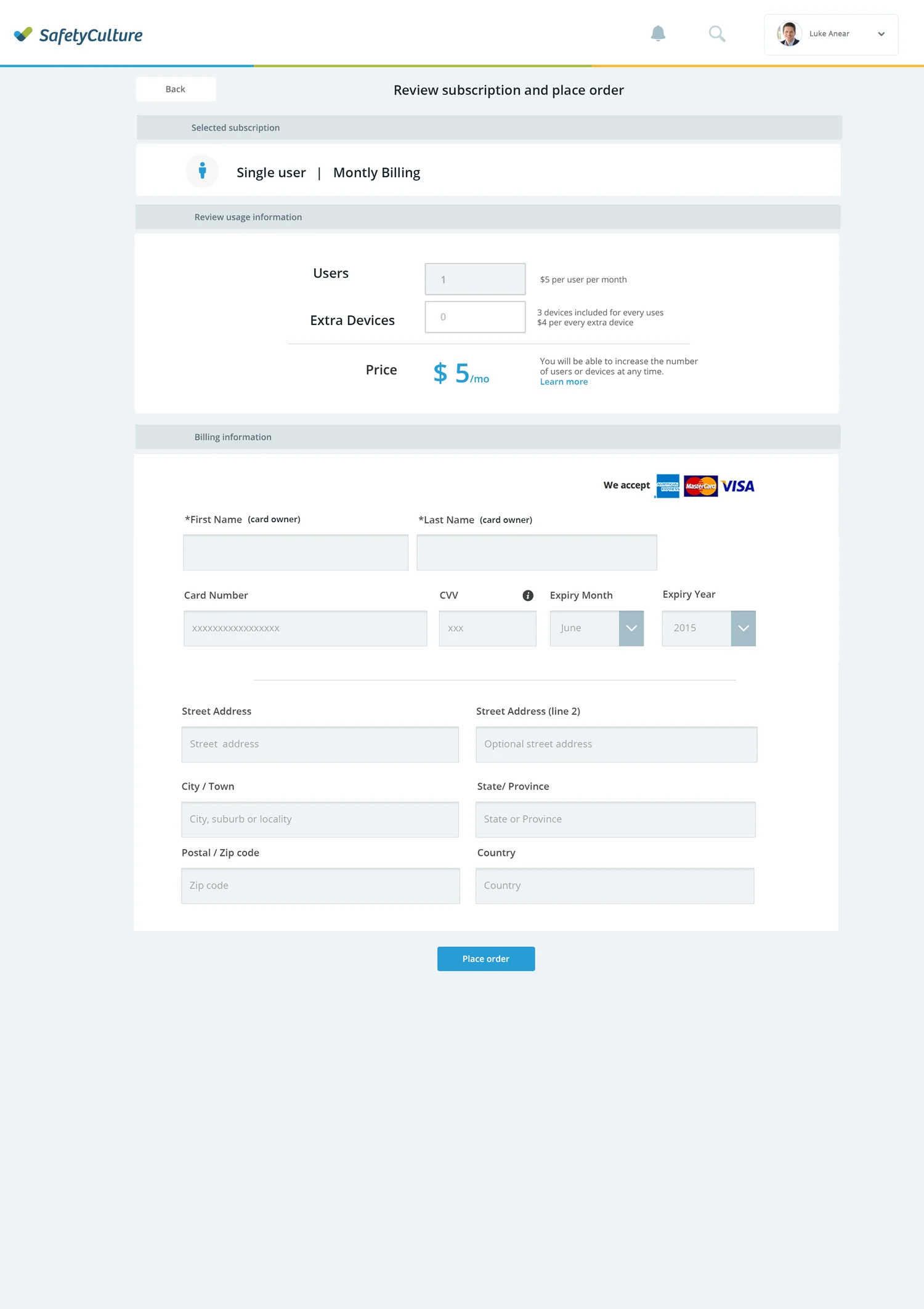
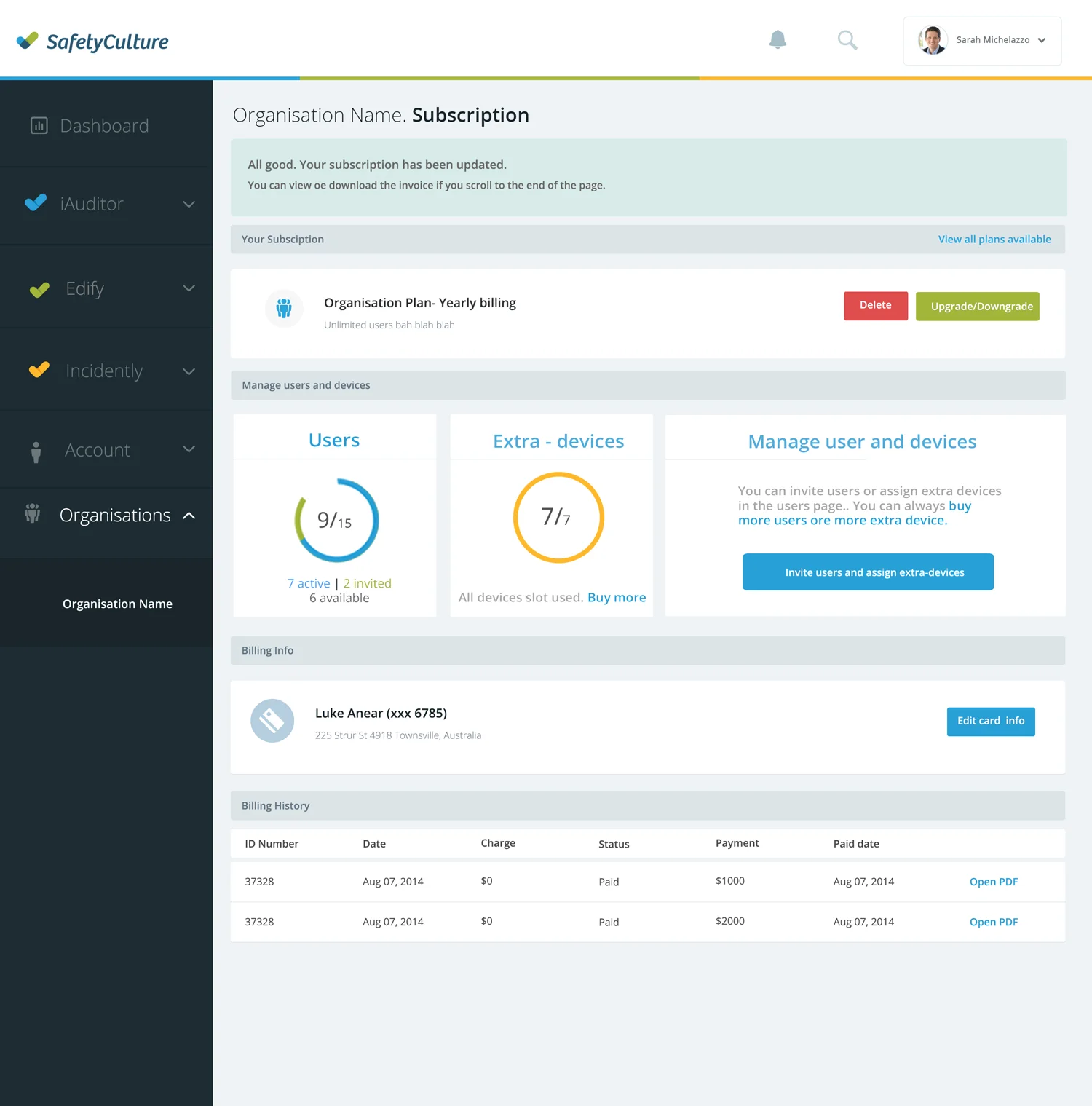

RELEVANT IMPROVEMENTS
RECOVER FROM ERROR
SafetyCulture targets both individuals than organisations. In the previous version of SafetyCulture many people entered the subscription area from the wrong entry point and weren't able to recover. In the new system there are two entry points but one and only Management page. In this way, if the user enters from the wrong entry point can recover, selecting which subscription he wants to activate: individual or organisation.
REMOVE 4 SCREENS FROM THE BILLING FLOW
Also the flow for the billing process was not linear for the users that hadn't filled their address details (most common user story). In the new flow, the user can add/edit the address during the checkout.
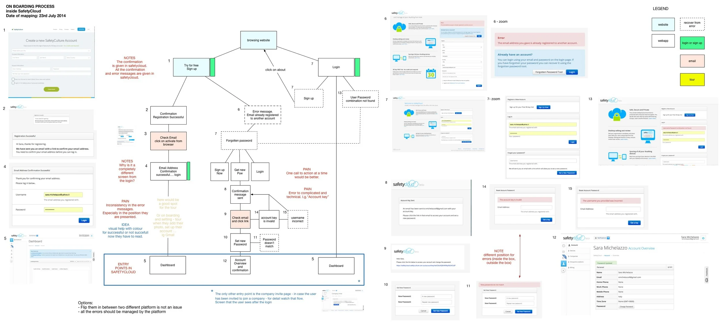
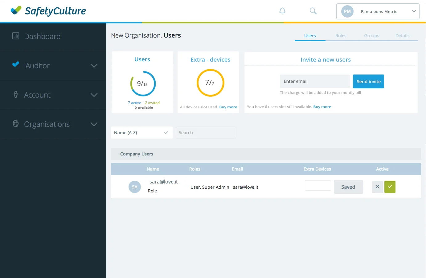
6. IMPROVE FLOW FOR USERS THAT ACCESS SAFETYCULTURE AFTER INVITE
MOST SUCCESSFULL ITERATION
BEFORE: the user that received an invitation email had to:
- click on the link - email
- sign up in SafetyCulture
- confirm email address - email
- login
- start using SafetyCulture
AFTER
- click on the link - email
- sign up in SafetyCulture
- start using SafetyCulture
The flow has been simplified, using the email used for sending the invite for the email verification, instead of asking the user to leave the platform and check his email again.
7. IMPROVE THE SIGN UP CONVERSION ON THE WEBSITE


A/B TESTING
The website runs A/B testing managed through Optimizely. One of the most successful iteration was to introduce the free app inside the pricing page. In order to understand better how users are navigating the website we used HotJar heatmaps to access user's videos playbacks.
8. IMPROVING THE COMMUNICATION VIA EMAIL

EMAIL INVENTORY
- FUNCTIONAL EMAILS: activate account, email confirmation, password reset.
- DURING TRIAL: getting started series 4
- TRIAL CLOSE TO EXPIRING: it is expiring, credit details…
- TRIAL EXPIRES: feedback + win back emails after 7, 21, 90 days.
- STILL MEMBERS: keep them engaged emails.
- RESURRECTION EMAIL: to users that tried an left.


REGISTRATION EMAIL
The branding has been updated but the biggest change in the experience is the number of call to action on the page: from 3 to 1.


INVITATION EMAIL
The invitation email has a clear referral to who sent the email. If the person that invites included a picture in his profile, the picture will be included. There is a clear call to action and some information about what clicking the button will unlock.
9. IMPROVE THE COMMUNICATION: ERROR AND CONFIRMATION MESSAGES
When working at the user flows, improving the communication is fundamental . We started rewriting the copy for the emails and than we set the Tone & Voice for the overall company communication across all the channels

error messages
The error messages have been changed from very technical to more user friendly. The goal of the error messages is always to help the user to recover. Often, they include the call to action suggested to recover.

CONFIRMATION MESSAGES
The confirmation messages have been introduced in the application for the main action. The Tone & Voice aims to increase user engagement and motivation. Some long tasks have been divided in sub-task that provide various confirmation messages to help the user to understand what's next in order to achieve a goal.

feedback messagES
Feedback messages has been introduced for actions that apply changes that are not immediately visible to the user like: duplicate, archive, resotore, save.
10. PROVIDE A WORLD CLASS SUPPORT SITE
DEFINITION OF THE PROBLEM
People call the support for things that are very basics. Why they don’t know them already? Why they don’t solve the problem by their own? Are we offering them the right tools?
STRATEGY
Some of the common issues should be solved at a level interface. The onboarding should be the starting point. When the user can’t perform an action, the interface should guide him to complete the task so that the user doesn't need to interrupt the task to find a way to solve his problem.
Redesign the support page in a way that invites users to learn about the product and to find the solution for their problems before they contact the support.
Change the Knowledge base into a Learn & Support approach and/or self service approach.
Metric of success.
Reduce the number of times that users contact support for basic things. Harder to measure but a successful support increases: happiness, engagement, adoption, task success.
Low hanging fruits
- Invite users to solve their issues before they call support - modify wording (self service...)
- Make solving issues easier than contacting support - restructure navigation
- Define basic problems —> FAQs
- Invite users to explain their issue clearly when they contact support - email/contact form.
- make the home page of the support web page more inviting - view Pinterest collection.
- one clear path - a link - that can be shared easily to help people to become proficient.
RESEARCH & analysis
How people are currently using the support?
Tools and experience design methodologies:
HotJar (heamaps and play back)
Google Analytics
Interview with support team
surveys
Test the old and new navigation with Treejack by Optimal Workshop
How other successful company organise the support area?
How users contact support? Map and define all touching points.
What the support consider an ideal path?
Does iAuditor have a learning curve? How people became proficient with iAuditor in the past and what is their favourite way to learn.
BEFORE
AFTER


EXTERNAL LINKS TO LIVE PROJECTS
The next case study is about advocating a user-centered culture and how to implement a strategy and a process to support it.